Thursday, October 27, 2011
Magazine Masthead Examples
Here are a few examples of typefaces that I am considering using for the masthead of my magazine cover. I created the typeface on the top left by using the Wacom tablet in Photoshop then creating a vector image of it in Illustrator. The rest of the typefaces are from InDesign. I originally wanted my masthead to have a elegant handwritten look, but after exploring many different typefaces I am now leaning toward the simple and "clean cut" style typefaces.
Tuesday, October 25, 2011
Monday, October 24, 2011
Magazine Mood Board
Here is my mood board for my magazine cover. I decided to go with an earthy "boho" tone. My magazine will reflect a unique and eclectic style. I am still going to create a fashion magazine that is geared toward young middle-class women, but my magazine will focus on more natural and toned down approaches to beauty and fashion rather than the stereotypical glamorous and "over-the-top" approach.
Thursday, October 20, 2011
Magazine Mind Map
Here is my mind map for my magazine cover. I think I'm going to go in the direction of creating a fashion/beauty magazine for young women in their 20's (like me). The magazine will be geared toward "average" women who are looking for fashion/beauty ideas and tips that fit their tight budget; it will be somewhat of a break from current fashion/beauty magazines that target wealthy upper-class women.
Monday, October 17, 2011
Thursday, October 6, 2011
Google Sketch Up
Tuesday, October 4, 2011
Finished Seed Packets


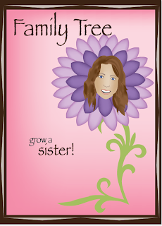
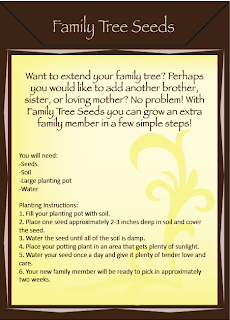
Here are my finished seed packets. I did a lot of refining of my original designs, especially on the faces and flowers. I learned a lot about Illustrator and it's capabilities through this project. After looking back on the first few assignments that I completed in Illustrator, I am confident in saying that my skills and understanding of certain tools has definitely improved.
Subscribe to:
Comments (Atom)


